 Reporting is a big part of any project and no matter what methodology you use, it has to be done right. Last week I took a look at the general reports found within Eylean Board and today i want to focus on the ones tailored for Agile users.
When creating Eylean Board we wanted to not only improve your Scrum, Kanban and other boards, but to also improve your tools. This mean automating the most common reports and giving you instant access to data you require in decision making. Forget your headaches trying to sum up and analyze data. All you have to do is look at it and make your decisions.
So what Agile reports have we prepared for you? Let’s take a look!
Burndown Charts
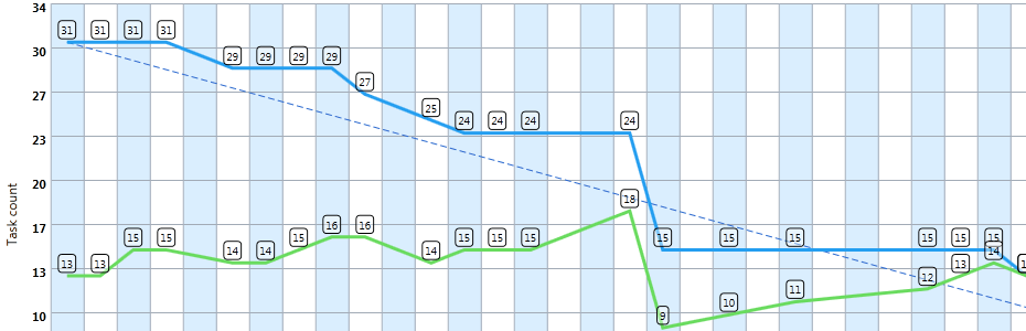
Need to measure the progress of your team? The burndown chart can do that by estimation hours, complexity points or number of tasks. You will be able to check the burndown path (green line) that shows actual remaining tasks at each day. Note, if you are adding tasks more quickly than finishing them, this line will actually go up. The cumulative burndown chart (blue line) sums up all the work increases and sets them to day one, later decreasing as tasks get finished. This way you get a more accurate representation of completed vs. remaining tasks. The estimated burndown path (based on the start and end dates of the project, blue dotted line) will show you the ideal way the project should be going. If your blue line is above this projection, you are falling behind and if you are below it, you are beating the schedule.
Choose the scope that interests you or look at the whole picture and see changes in team velocity right at the top of the chart.
Cumulative Workflows
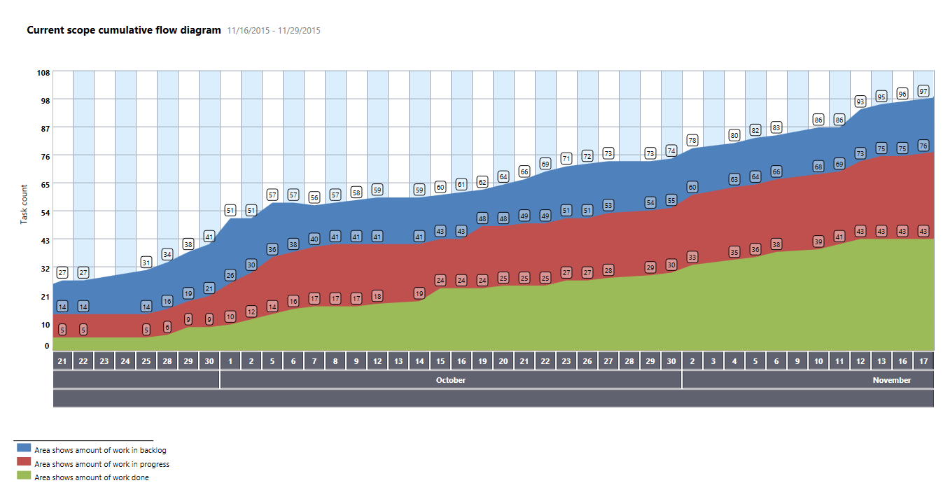
Want to take a different approach and look at how much work has your team accumulated since the beginning? Check out the cumulative workflows. You will be able to quickly evaluate the team working patterns and understand how much work is yet to be done vs. the completed tasks. This is a visual and easy way to quickly to check up on trends and identify and avoid issues. The green represents finished tasks, red- the tasks in progress and blue the tasks in backlog. The report can also be prepared by tasks, story points or estimations and set to any time scope.
Lead & Cycle Time
Lead and Cycle time reports will be interesting to all those Kanban users or those wanting to analyse their process. First, Lead time provides you with the period of time from the task creation to it’s delivery. And then cycle time gives you the time for the same tasks from when they have been started to until it’s delivery. So you can analyze how quickly tasks go trough the process and how long does it actually take to preform them.
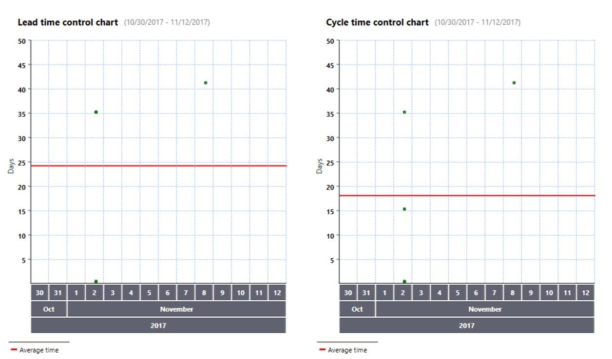
To view this data in Eylean you have three options: Lead & Cycle time charts, Lead & cycle time histograms and Lead/Cycle grid. The charts will give you a medium value as well as data for each specific date. As you can see each task is represented separately.
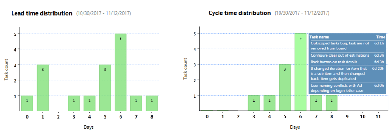
The histograms will present a summed up view of the charts. You will see duration of the task on the bottom and how many tasks took that long in the column.
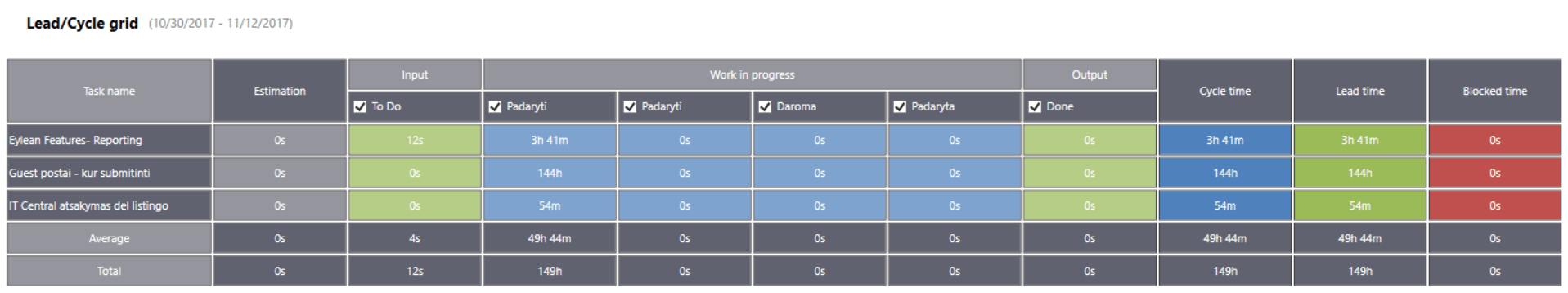
Lastly, if you want a more detailed view, take a look at the Grid. You will be able to analyze each task as it went through creation and each execution step. Thus being able to see where and how much of the time was spent.
Which Agile reports are your favorites? Share in the comments!


